How to read sleep graphs
Sleep graph is the main outcome of sleep tracking - it shows analysed data from all the sensors that were used during the night.
1. Sleep graph screen
The graph screen shows up to three graphs:
-
Actigraph: your activity or movement during sleep
-
Hypnogram: your sleep phases
-
Noise graph: ambient noise level (when noise recording is enabled).
Graph screen also shows statistics about your night, along with an option to rate and annotate the record.
The app uses Actigraphy – activity-based sleep tracking – as the method of estimating your sleep phases. We have shown in a study that our approach produces a very good match with Polysonography – the de-facto golder standard for clinical sleep tracking with a fraction of the costs. See How does Sleep as Android compare to the sleeplab.
1.1. Statistics
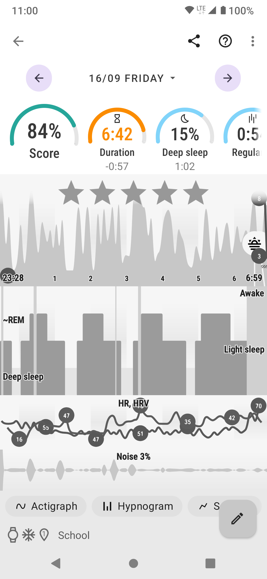
Figure 1. Sleep record statistics
|
|
1.2. Actigraph
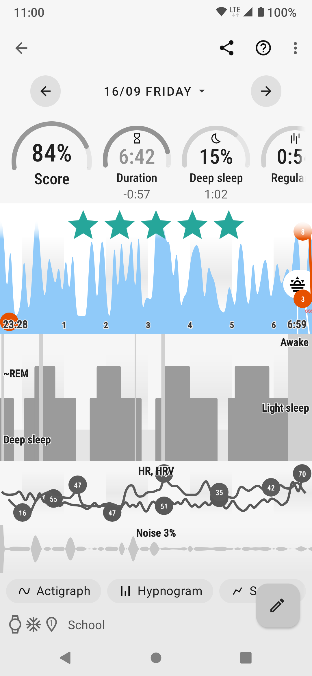
Figure 2. Actigraph
|
|
1.3. Hypnogram
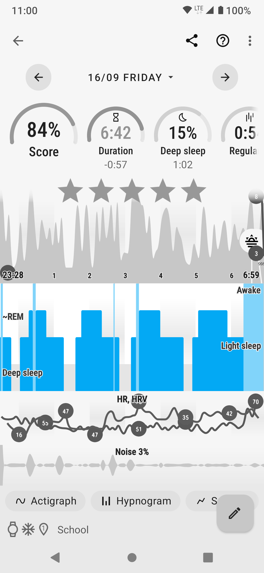
Figure 3. Hypnogram
|
|

Figure 4. Red sections
|
Red sections on your graph indicate that the app did not receive data from sensors at that time. This usually happens when using wearables due to lost connection to the wearable. The phone’s accelerometer can also (very rarely) malfunction. |
1.4. Noise graph
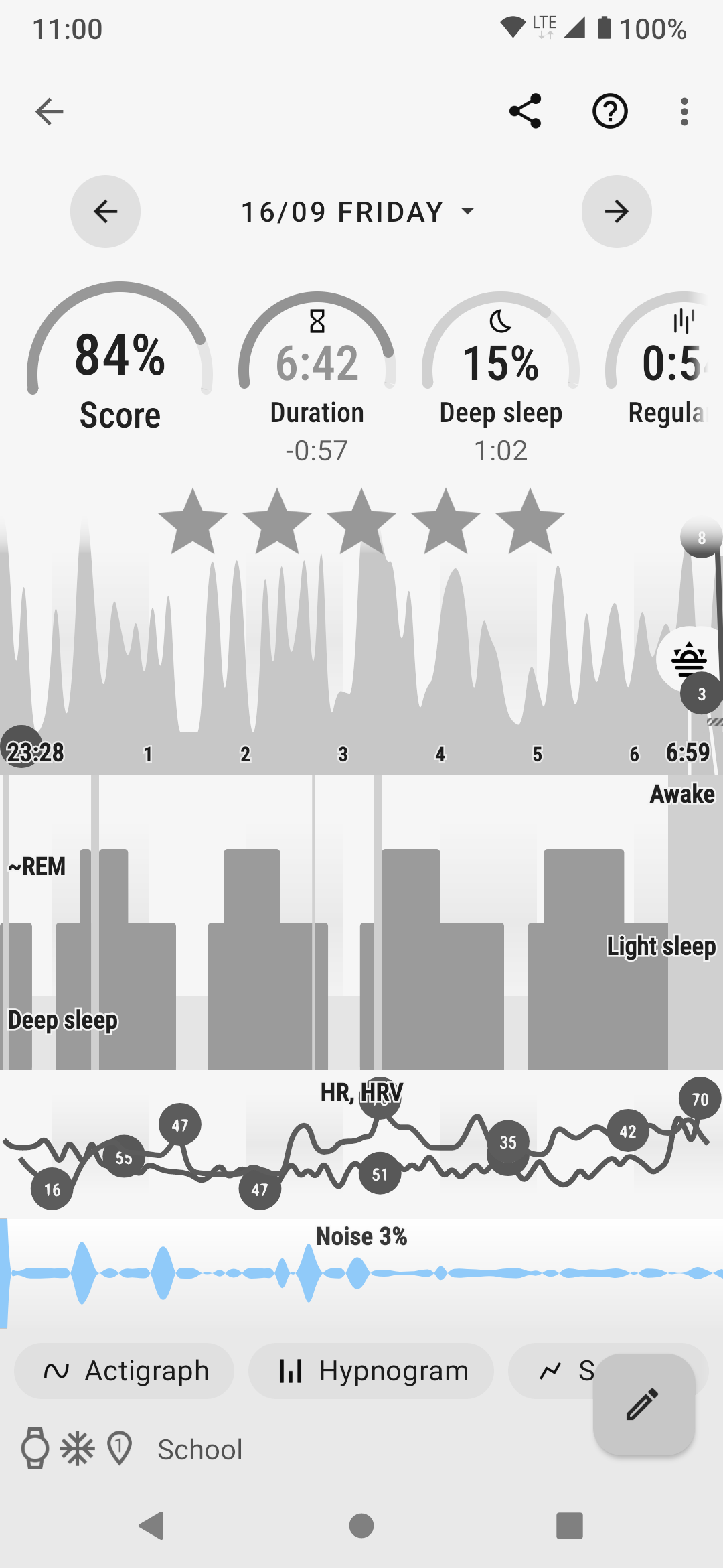
Figure 5. Noise graph
|
|
1.5. Colored lines
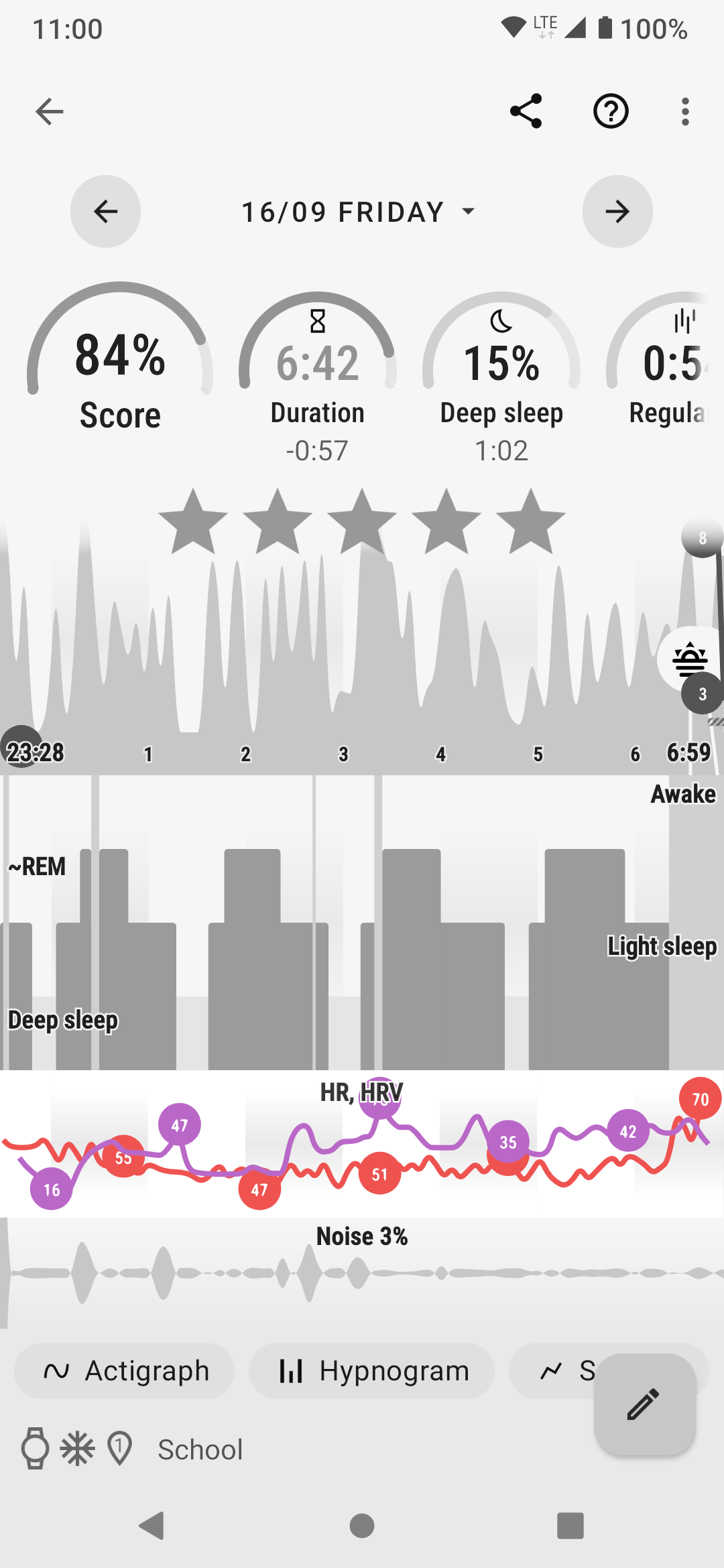
Figure 6. Oxygen level (Oximeter) + heart rate
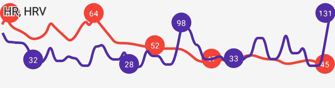
Figure 7. Heart rate + heart rate variability

Figure 8. Light level + heart rate

Figure 9. Breath rate (sonar)
|
|
1.6. Markers and Icons
Besides deep sleep, REM phase and light sleep, there are several other events depicted in the sleep graphs.
Icons on Actigraph |
|
Icons on Noise graph |
|
2. Morning rating screen
The first screen you see in the morning is Morning briefing and it offers you important information at a glance.
|
|
You can customize the screen in Settings → Personalize → Morning screen, see details here. |
See details in sleep score chapter.
Simplified graph, tap to expand it to the full graph.
Simplified noise level graph.
Simplified sensor data graph.
MetNorway or OpenWeather data.
Can be disabled in Settings → Personalize → Morning screen > Weather.
If you end the tracking before alarm, you can simply dismiss the upcoming alarm.
Rate you sleep with stars to add important feedback for stats, or add tags.
3. Guides
3.1. Editing graphs
For a guide on how to edit a graph, please see Graph editing.
3.2. How should the graphs look?
As a general rule of thumb that applies to healthy individuals:
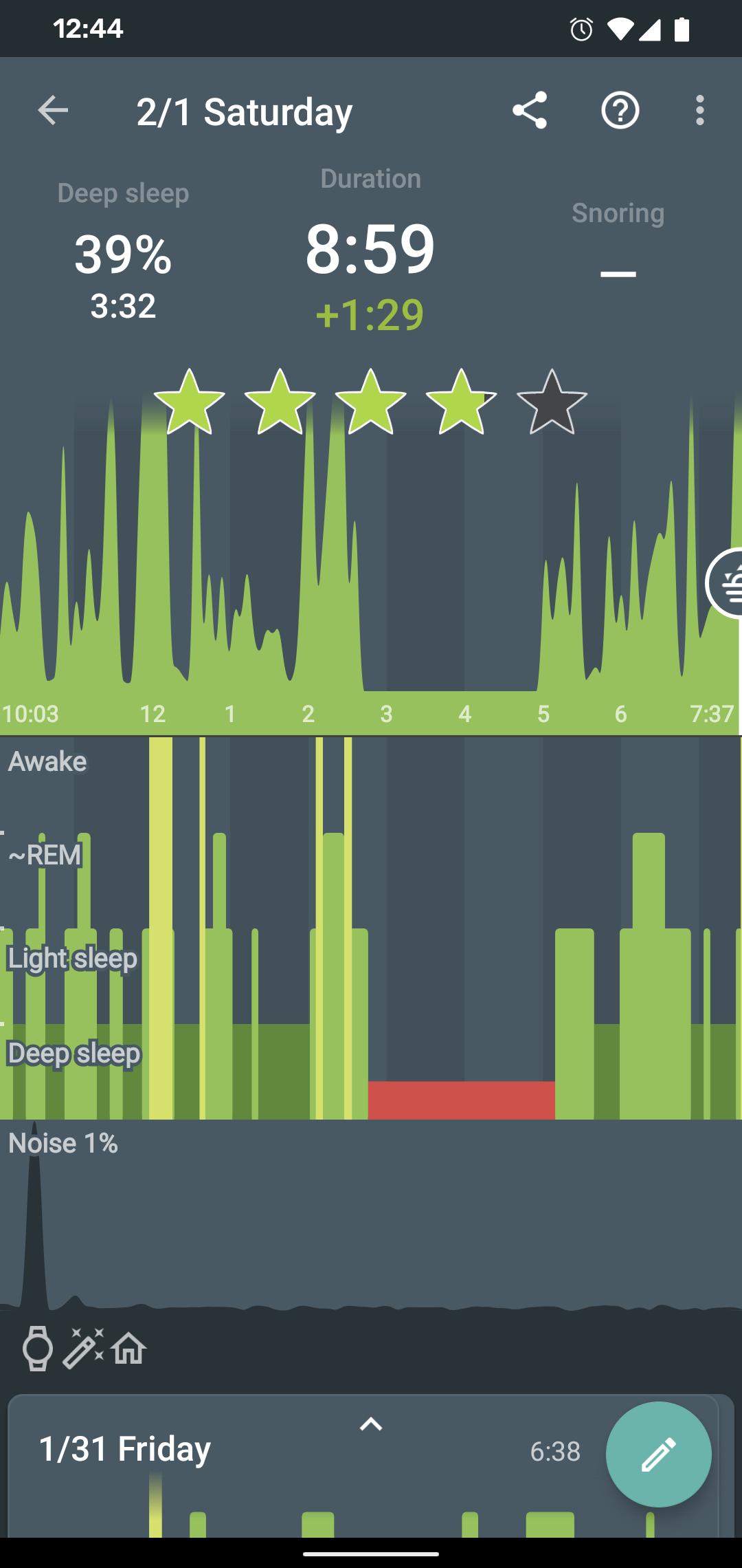
A healthy sleep (for a monophasic sleeper) is 7-8 hours long and consists of 5 sleep cycles where the first lasts for 70-100 minutes and the consequent cycles get longer but lighter. Each cycle consists of 4 stages lasting usually 5-15 minutes. Stage 1 and 2 are considered light sleep and this is the best time to be woken up in the morning.
A healthy sleep cycle looks like a 10-30 minutes of light sleep (high peaks) followed by an area of deep sleep (low peaks or no peaks) lasting 40-100 minutes.
Different resources on sleep may provide different figures though.
So deep sleep % may actually range between 30%-70%. Figures out of this range may indicate either incorrect sleep tracking setup or some sleep issues. For example very low deep sleep % may indicate either sleep deprivation or issues in your life style such as higher alcohol or caffeine intake, not enough sport etc.
3.3. Comparing Sleep as Android graphs to sleep lab
Ever wondered, how precise the sleep tracking with only a mobile phone could be?
We had the opportunity to compare our algorithms with sleep-lab clinical study, and the results are very promising!
The chances the smart alarm will be triggered properly (not in deep sleep) is 96%.
Lucid cues have a 50% change to hit REM phase.
Awake periods just from movement intensity changes (no other awake heuristic like sound detection, light detection, HR monitoring) can be detected with 30% success.
You can read more details about the study on our blog post here.
If you are interested how the REM detection with Sleep as Android works, you can read it here.
FAQ
It is possible to revert up to 5 changes made while editing a graph.
-
You can use the Undo banner (appears each time you change a graph):

-
Or you can use ⋮ menu → Undo option
If you delete the graph from the Sleep app and it comes back later, check if the graph has ![]() icon. These graphs are synced from an external service - either Samsung Health, Health Connect, or Google Fit.
icon. These graphs are synced from an external service - either Samsung Health, Health Connect, or Google Fit.
If you delete the graphs there too, the they won’t reappear in the Sleep when you delete them.
Sleep duration is the sum of all your sleep stages (light, REM, and deep), not including waking stages - because you are not really sleeping when you are awake.
So on default settings, your Sleep Duration ,ay be a little shorter than your tracking time.
If you want your sleep duration to be the same as your tracking duration:
-
Disable the awake detection in Settings → Sleep tracking → Awake detection.
-
You can also try to adjust the sensitivity of each type of settings to get optimal results. In most cases, too many awake periods are caused by significant HR peaks.
-
If you are not sure, where these awake periods are coming from, please use the Left ☰ menu →
 Support →
 Report a bug, and send us the application log.
We use a different input than polysomnographists, and define our own sleep phases, reflecting an objective aspect of sleep, easy to measure with common devices. One naturally needs to ask whether there is any relationship between the EEG-phases and our ACT-phases.
Fortunately, several research teams raised similar questions before (See this one, or this one, or this one, or this one). They measured a bunch of people on a traditional polysomnograph and recorded their physical activity at the same time (By filming them and then counting the movements manually, or by using accelerometer readings). The published analyses show that there indeed is a significant statistical relationship between EEG-phases and body movements.
You can also read about comparison of Sleep as Android algorithms and Sleep lab results on our blog here.
Accelerometers are really sensitive, which is great for sleep tracking. Usually what you see when you leave the phone on the table is immediately dwarfed when you make a more significant movement. Just leave the phone on the table for a while and you will see a dramatic spike, but then move the phone and you will see that all the development is really tiny compared to the new peak.
So what you see is random noise caused by very small vibrations of the table or in very quiet areas by seismic movement. We mark the data relatively, so you can always distinguish between light and deep sleep. However, the algorithm works well only in conditions, it assumes i.e. in the bed with relatively large movement peaks.
To be more precise, if you leave the phone on a table, you may get values perhaps in the range of 0.000001 to 0.000009 m/s2 (the value is made up here, but it is physically very small). In the bed, you can get values from 1 to 9 m/s2 (which is physically large). However, the algorithm only sees that the high value is 9 times higher than the low value in both cases.
We had to do this because each accelerometer (in different phones) measures differently, so we couldn’t assume a standard conversion formula that responds to absolute values.
So if you use the phone in bed, it is indeed drastically different from measuring in a quiet place, like the table.
Please do not hesitate to contact support@urbandroid.org for clarification. You can also read more about how our data compares to sleep lab results at in this post.
There are several reasons why your graphs may be flat.
If you can see some movement on the actigraphy, but the graph is unusually flat:
. Sonar - make sure the signal is strong enough by keeping the sonar volume at max at Settings → Sleep tracking → Test sensor → blue sliding bar.
- You can also try a different frequency by selecting other frequency from the drop-down menu list in Settings → Sleep tracking → Test sensor → Frequency
- Keep the phone closer to your bed.
- Try different positions of the phone.
. Accelerometer - try keeping the phone closer to you.
-
Disable all system restrictions applied to Sleep as Android, or any companion app for tracking with a wearable: https://dontkillmyapp.com/
-
If there are too many awakenings falsely estimated on your graph, use the Left ☰ menu →
Support → Report a bug, and send us the application log. -
Most often the awakes are driven by significant HR peaks (awakes align with HR red line graph), you can try to disable this type of awake detection in Settings → Sleep tracking → Awake detection → Heart rate monitoring.
-
Another common cause is phone screen turned on, you can try disabling the Awake when using phone awake detection in Settings → Sleep tracking → Awake detection → Awake when using phone.
If the tracking stops completely after few minutes, the background processes are restricted by your system.
-
Make sure no system restrictions are applied to Sleep as Android, or any companion app for a tracking with wearable: Check our guide here.
-
If the guide won’t help, send us your log using Left ☰ menu →
Support → Report a bug.
The red block indicates that something went wrong with tracking at that time and the device stopped providing sensor data for some reason. Usually those are some non-standard battery optimizations or battery savers, the battery gets too low so we preserve it for the alarm or connectivity issue if you use a wearable.
1. Battery restrictions
Make sure no system restrictions are applied to Sleep, or any involved apps like wearable companion app).
See our guide here, and follow the instructions.
2. Too low battery
When the battery is too low (usually below 10%), data collecting is terminated to preserve enough battery for alarm.
When the battery was too low, there is a battery icon is displayed on the graph:
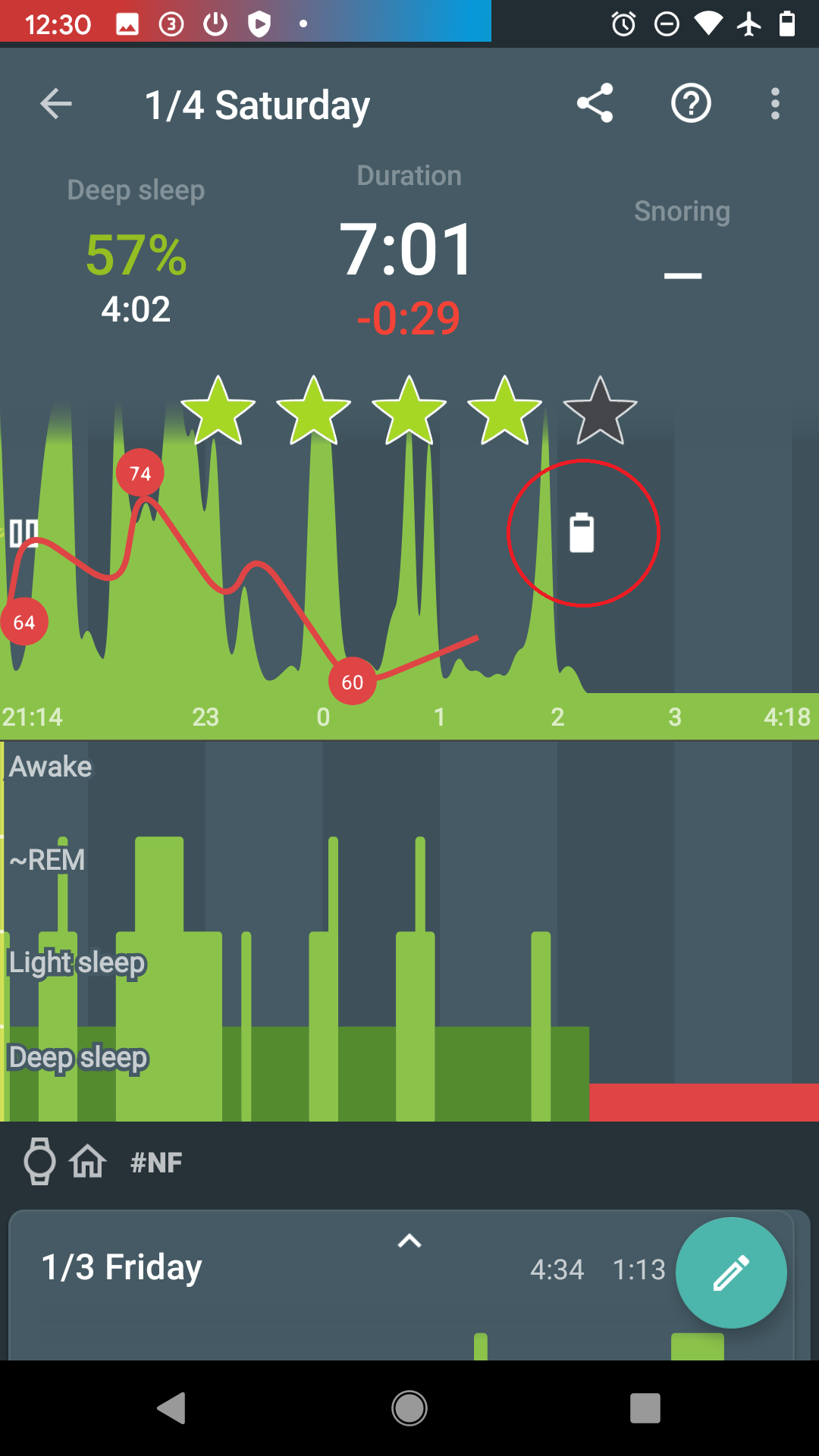
3. Connectivity issues with a wearable
When the connection with the wearable is lost, you can see red sections on the graph. The app always tries to reach the wearable again.
The graph can look like this:
-
Opt-out from any battery restrictions is applied by your system (https://dontkillmyapp.com/)
-
Pair the wearable with your phone in System settings.
-
Make sure the BT is not lost, and try lowering the distance between the phone and the wearable.
-
Try settings the device as Trusted device.